MasterNewMedia by Robin Good
MasterNewMedia Interface Design Contest
Design Submission by Emil Milanov
Ref. site URL: http://www.milanogw.net
Bio:
Emil Milanov is 25 years old new media designer based in Belgrade, Serbia.
He has formal education connected with Marketing and background in media planning.
Currently, he's engaged on several design projects as graphic and web designer where he creates web standards based web sites.
Showcase of his work can be found at http://www.milanogw.net
Resume URL: http://www.milanogw.net/emil_milanov_resume.doc
|
MasterNewMedia Home Page Proposal |
 | |
| MasterNewMedia Individual Article Proposal |
 | |
|
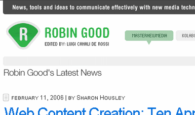
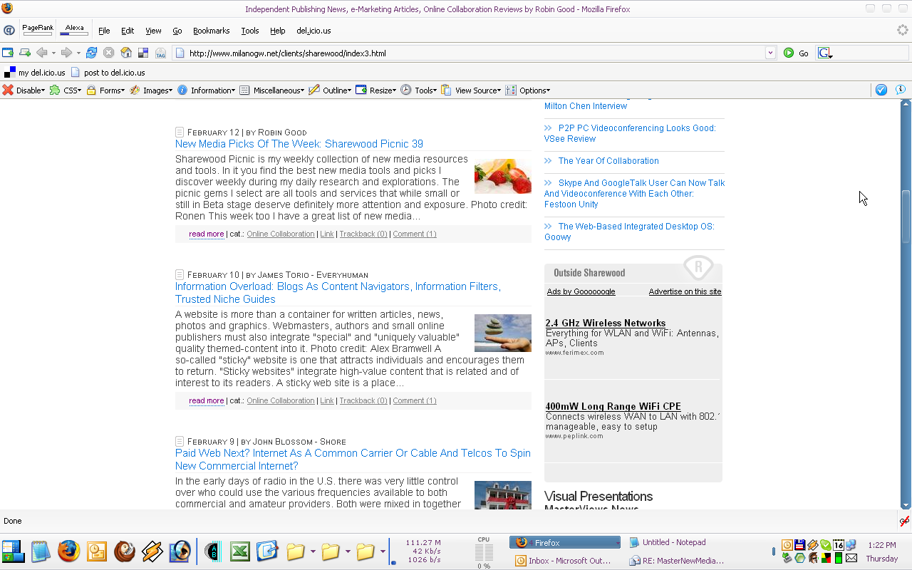
Hello Robin, Here is rationale for my design contest proposal: 1) Information architecture a) Header I kept pretty similar way of presenting data that you have now. As for stylizing search and newsletter forms, I know you prefer them in generic form, but I had to do something with them. I kept generic color of search and subscribe buttons, and added nice looking search and newsletter icons, that don't scream for attention, but explain what are input fields are for. b) Article format I made little research through other blogs before I came with my solution. Difference is that now date and author are before article title. In general, I'm aware of the fact that article title is the most important, and it's distincted by font size and color, explanation for putting date before article title is that it shows how frequent you update your site and how fresh is the content which I think is very important especially for new visitors. Also, since you have multiple authors on your blog I think that it would be good that you make author name as link which would lead to author's short bio. Concerning category and category news archive, for example, under article you have links: 1) Online Collaboration and 2) Online Collaboration News Archive I have comment to make: Since category page and category news archive are completely the same with difference that on the first news archive is on the bottom of the page and on the second news archive is on the left side, I find that is 1) confusing 2) Frustrating ( I think it's not ok to click two links one beside another and get to same pages) 3) is creating clutter with no need This comment also refers to 'Reference' (right column) where you have: category title, xml link, news archive link and latest article link. My proposal is to remove one of the links. (category or news archive) c) adsense integration I just added top and bottom bars to google ads on (right column) that on one hand describes that by clicking on them people will get out of your web site and on the other hand they look more integrated into design. d) links I took little risky way with them. I know that all text links should be underlined. I took approach where only bottom border of link is underlined based on my personal preference. Would like to know what you think about that. 2) Coding I think I did very good job in this area. a) Html validates as XHTML 1.1 STRICT, (before you used transitional) For you, as an author there are two differences: 1) when you want to create link that opens in new page you won't be able to use 'target="_blank" as you did so far, because target attribute is depreciated in xhtml strict, but instead you should use 'rell="external"' 2) for inserting images there is no need to use attribute 'border="0" (border att also doesn't validate as xhtml strict). That attribute is now defined through css and you can forget about it. b) css is css 2.0 valid c) web site is completely tableless. At the moment you use tables on your web site which is not ok if you want to have web standards based web site. Tables would go ok with validator, but they are not valid conceptually. Tables should be used for presenting tabular data, not for formatting content. d) Dividing content and layout design. Let's say this is the point of web standards. To achieve this goal I used image replacement technique for all images that are part of layout. For example: For inserting logo image I didn't use img tag, but I replaced it with H1 tag that says: "Independent Publishing News, e-Marketing Articles, Online Collaboration Reviews by Robin Good", also your tagline that for end users looks like image in html it looks like: News, tools and ideas to communicate effectively with new media technologiesThe same counts for top navigation and network navigation.e) concerning java script, here is what I used: 1) java script for opening pages in new window (since target attribute is not xhtml strict valid) 2) java script for preloading hover images for navigation 3) java script for detecting screen resolution and loading different style sheets based on it That is about it. I'm looking forward to see results of your competition. | ||