Transforming World Statistics Into Visual Stories: Jonathan Harris
If you are interested in data visualization for the scope of providing valuable and entertaining information to a wide and popular audience, this mini-manifesto from Princeton University Information Networks Archive (INA), may give you some good inspiration.
Prepared by Jonathan Harris of Flaming Toast Productions (now Number27), this large and highly visual information displays mini-gallery make it easy to learn and explore large amounts of data while getting the whole picture at the same time.
Of course the question always is, how reliable and trusted are the sources providing the data behind the plushy info graphics. But that, is another story by itself.
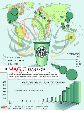
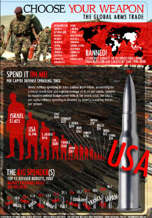
The infographic maps included in this 9-page PDF created for Princeton University INA, depict the state of the world under different aspects. Here some of the most interesting ones included:
- Choose Your Weapon: The Global Arms Trade
- SSSmoking - The Global Tobacco Trade
Chemicals in cigarette smoke - Red Tape - The Government Grind
- Who's Paid What
- Getting Around - Transportation Today
- The Glass Half Empty - The Coming Water Wars
I highly recommend the information design and data visualization work of Jonathan Harris. His output is constantly cutting-edge, though at the same time simple, elegant and accessible.
I always like what I see at his site and I do recommend paying a visit to his admirable work with Flash and images, I have showcased and praised here before.
Reference:
INA
Flaming Toast Productions
The information graphics presented here are part of a downloadable 9-page PDF manifesto, part of the ChangeThis series. Download it here:
http://changethis.com/11.INA
blog comments powered by Disqus