Curated by: Luigi Canali De Rossi


Monday, December 15, 2003

Separate Design From Content Publishing

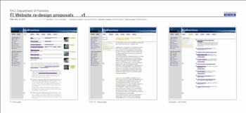
It is through pure coincidence that I have stumbled upon these interface designs I had created three years ago for FAO, an organization of the UN.

FAOFisheriesDesignPanel01.gif
Click to enlarge

FAOFisheriesDesign01.gif
Click to enlarge

These designs were created for the Fisheries Department and were the consequence of a long and well structured process of communication research and analysis.

In this exemplary case, the interface design was effectively based on key communication goals and on having deeply analyzed the content available, the user interests and the communication goals set out by this department.

In these prototypes, the effective use of a few critical information design concepts made all of the difference in reaching that delicate balance, equilibrium, ease of access and legibility that appears to make things pleasing to the eye.


Unfortunately, much of that purity, cleanliness and well-though out organization was to be gradually lost due the many compromises and "refinements" made to those original design as the site was maintained and updated through these three years.

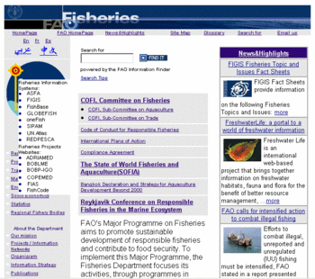
Present FAO Fisheries web site home page
presentdesign200312.gif

For as much as I can see a pattern in this, it is one that shows how much the workflow, policies and publishing guidelines of an organization (or lack of them) can affect the ability of anyone department to effectively maintain and disseminate information online in a professional and efficient fashion.

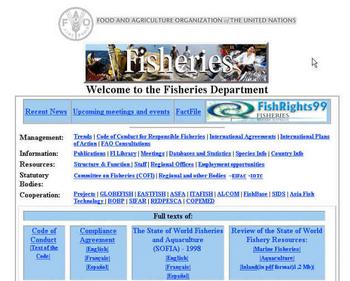
Even if you look below at what the FAO Fisheries home page looked like before these new designs were adopted you will likely ask yourself why it is still so hard to keep design functional and clean while accepting the continuous income of new requests, upgrades, additions and extras that would appear to leave any "webmaster" with no other solution but to surrender to a complete design anarchy.

originalFAO2000.jpg

It is evident that it is not the webmaster fault if this keeps happening, but rather the much anticipated consequence of not separating design from content, while easing and decentralizing the core publishing tasks directly to authors through the use of simple, non-proprietary, standards-compatible, inexpensive and easy to use content management systems.

Whatever resistance you are making to this transition it is hopeless. No matter how many good reasons you have for keep doing things in this way, you need to separate design from content publishing or you will end up just like these designs.


See also:

  • The Holistic Approach To Online Communication Strategy
  • Effective Content Management Comes Of Age

  • How Can I Try Out A Content Management System?

  • The Death Of The Webmaster: Why Weblogs Bring A True Revolution To Internet Publishing

  •  
     
    Readers' Comments    
    2003-12-16 18:05:19

    ThinkPositive

    Robin,

    "the much anticipated consequence of not separating design from content"... and not giving design its due importance, allow me to add.

    It's hard to accept that the interface supports understanding of the information, that it's the sum total of the choices made behind the scenes: communication objectives, content, audiences, interaction, services. It's hard to accept for a few reasons, in my opinion:

    1. visual design has had a very bad press first with the sprawl of badly designed web sites, and later with the anathemas of the usability gurus, so we've gone from "we want a nice site" to "we don't go for aesthetics";

    2. there's a lot of information technology perspective that gets into interface design;

    3. user research, if and when done, is a pandora's box: only sorrows and evils are seen in it, very few care about hope. In management terms, hope means feeding user research results into redesign/maintenance/improvement without feeling guilty for not getting it right the first time;

    4. interdisciplinary approaches - just another word for holistic when you get to the operational side - can hardly find a home in organizational hierarchies.

    Looking at these points, a pattern seems to emerge: the pendulum is swaying from the eyecandy extreme to the structure+process one. It will probably sway back and with some lessons learned along the way, it's just a matter of time until design will regain its place. And possibly, it will stumble into the insights that may come from user research.

    However, the issue with this pattern is that it's still a binary vision: a go-between across a range of possibilities marked by two concepts. The challenge is in broadening this view: point 4. is the truly difficult achievement because it entails accepting that Web publishing is complex business. It's a harsh reality, but as someone said, there's some comfort in truth.

    Pandora


    posted by Robin Good on Monday, December 15 2003, updated on Tuesday, May 5 2015

    Creative Commons License
    This work is licensed under a Creative Commons License.

    972


    Real Time Web Analytics